Legacy of Frank Lloyd Wright
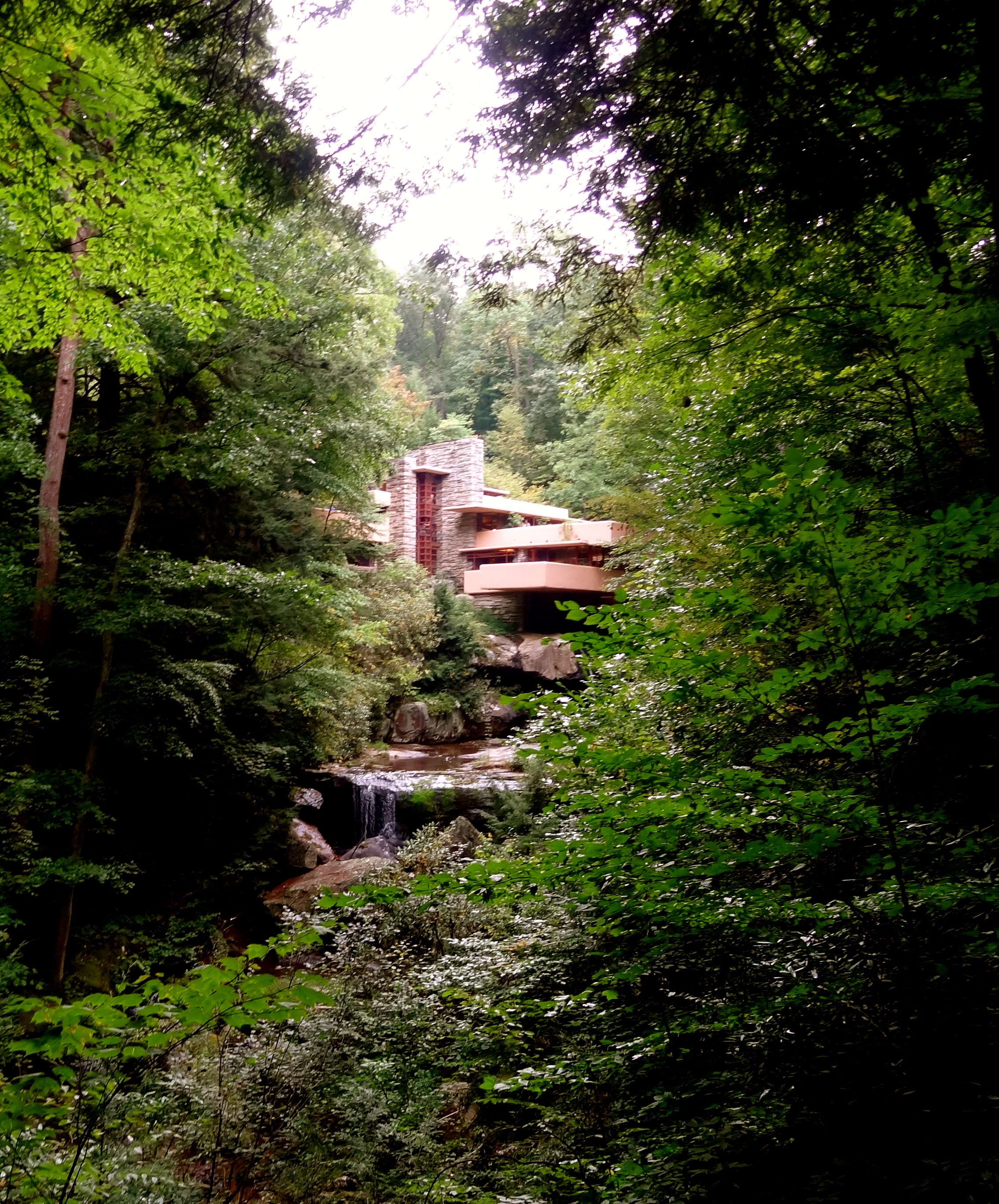
Finally, I got a chance to visit Fallingwater, a house designed by Frank Lloyd Wright in 1935. I had long dreamed of this trip. And Wright didn’t let me down. As he is always right.

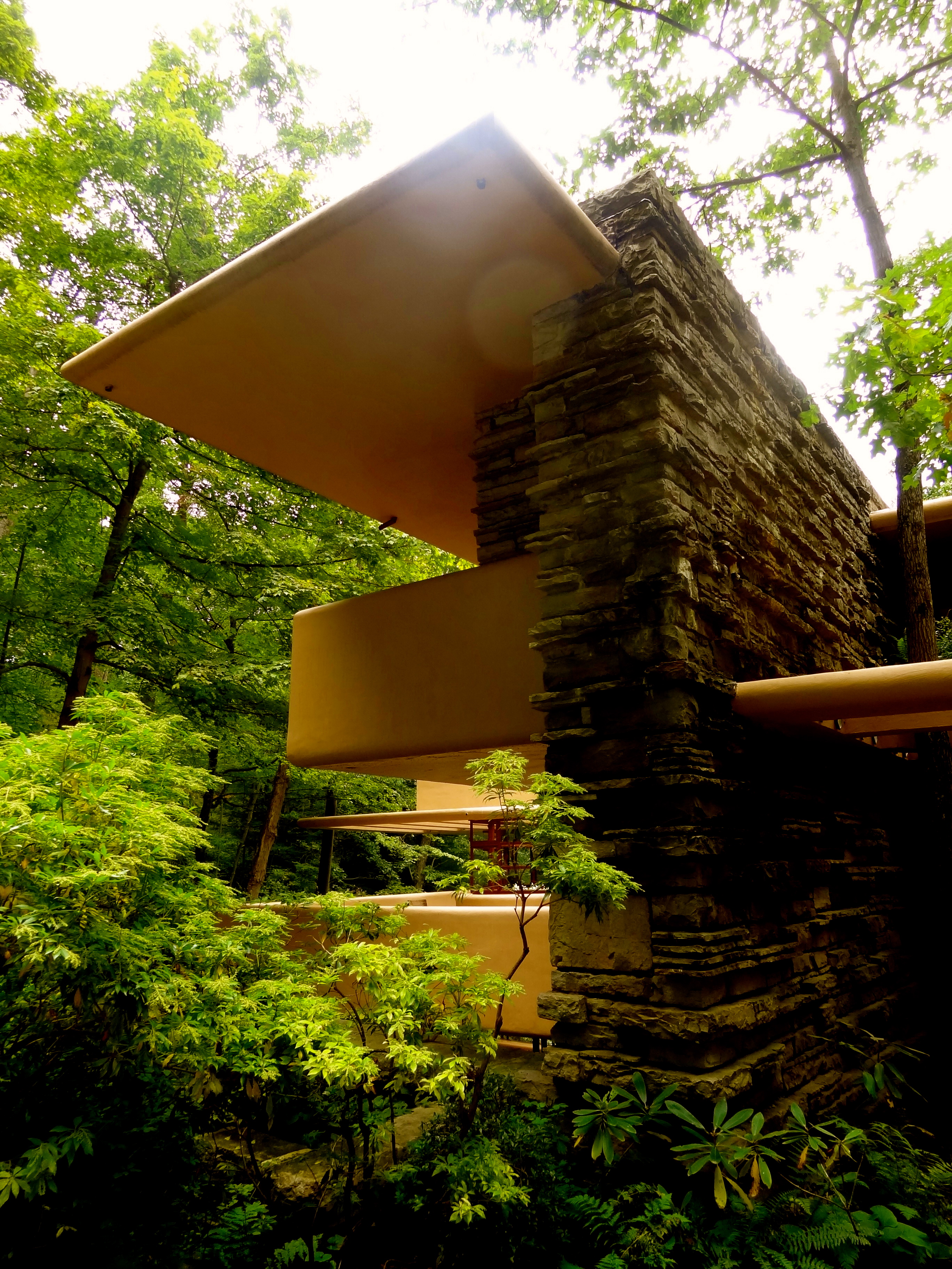
With narrow rooms inside, this house is organically designed so that people are ‘forced’ to come outside, to connect with the nature. On the other hand, we’ve seen rocks inside the living room and a corridor in the house, as an extension of the outside. This intertwined theme, the combination of nature and design, can be seen in every single dimension of this house.

Another thing to notice is that Wright kept a uniformly horizontal rhythm in his design. The lines formed by shelves, tables, beds, etc. are aligned in such a paranoiac way. Even the stairs were designed without handrails so that the rhythm can be continued and extended.
Unfortunately, we only had the regular tour because the in-depth tour tickets were sold out when I was purchasing online. However, it gives me a good reason to see this place again. Maybe the brunch tour or the probably-overpriced sunset tour next time.